Introducing Product Personalizer
Welcome to the Product Personalizer! Product Personalizer is a powerful and versatile tool designed to help merchants offer a personalized customization experience for their customers. By integrating this module into your store, customers can create unique products by customizing them online according to their preferences. They can add text, images, choose colors, styles, and more to craft one-of-a-kind items. Whether your customers are browsing on a PC or mobile device, Product Personalizer ensures a seamless and consistent user experience. It includes a variety of configurable options that adapt to different product types and industry applications. With Product Personalizer, you can:- Enhance user engagement and boost conversion rates.
- Expand the scope for personalized product designs.
- Increase customer satisfaction and brand loyalty.
Use on Desktop Devices
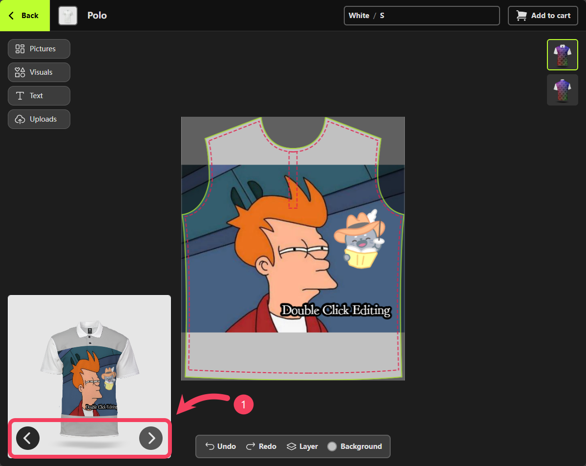
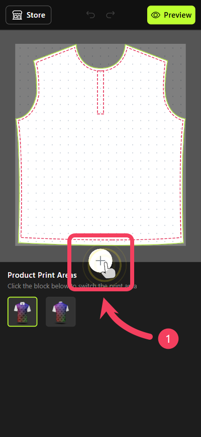
At the top right of the Personalizer, you can view and switch between all available product options, such as color, size, and more.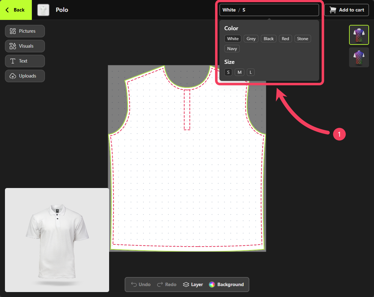
Pictures feature, please visit Picture Collections tutorial.
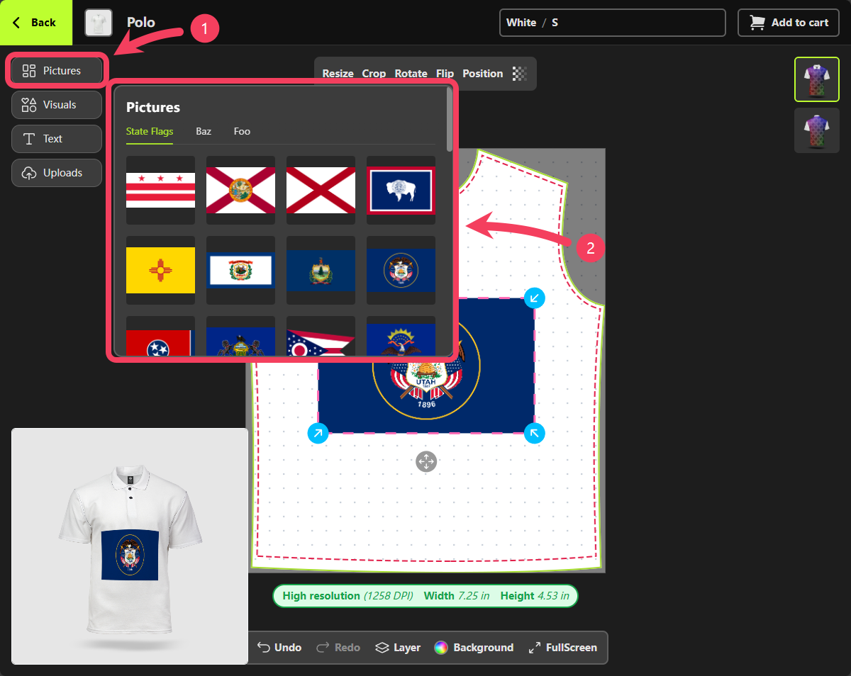
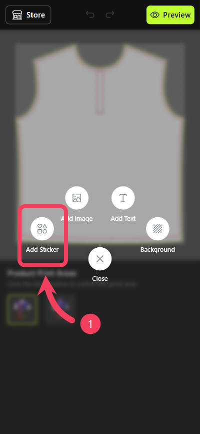
- Select Pictures as your method for adding design element.
- In the Pictures panel that appears to the right of the button, choose your preferred image and add it to the canvas to begin designing.
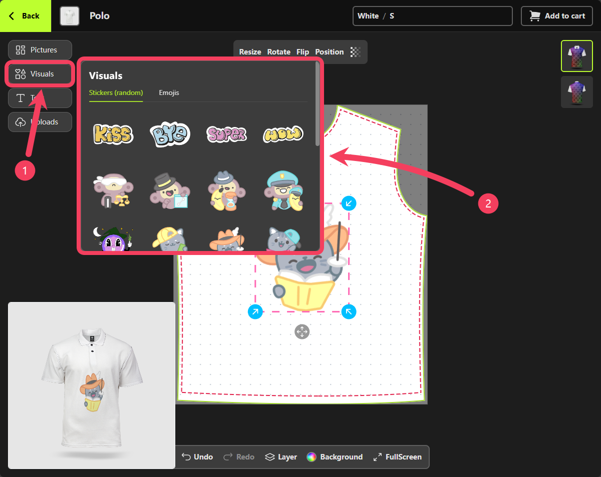
- Select Visuals as your method for adding design element.
- In the Visuals panel that appears to the right of the button, browse and select your preferred visual to add it to the canvas.
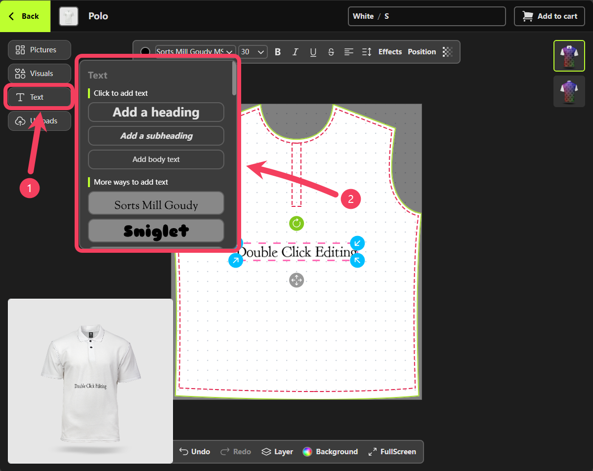
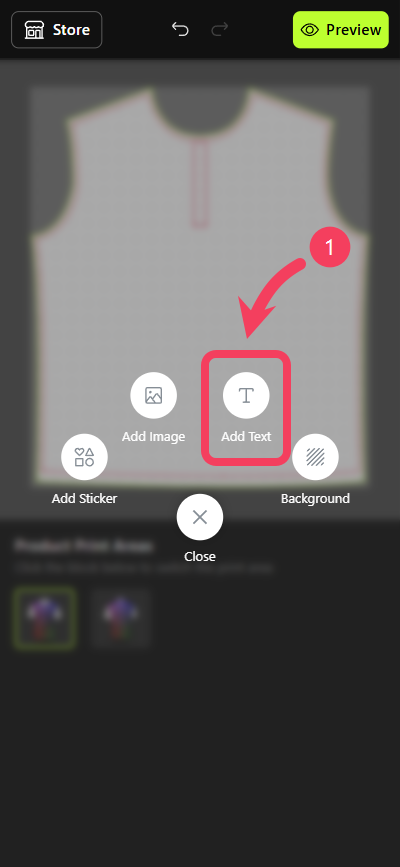
- Select Text as your method for adding design element.
- In the Text panel that appears to the right of the button, choose your preferred font and add it to the canvas to begin designing.
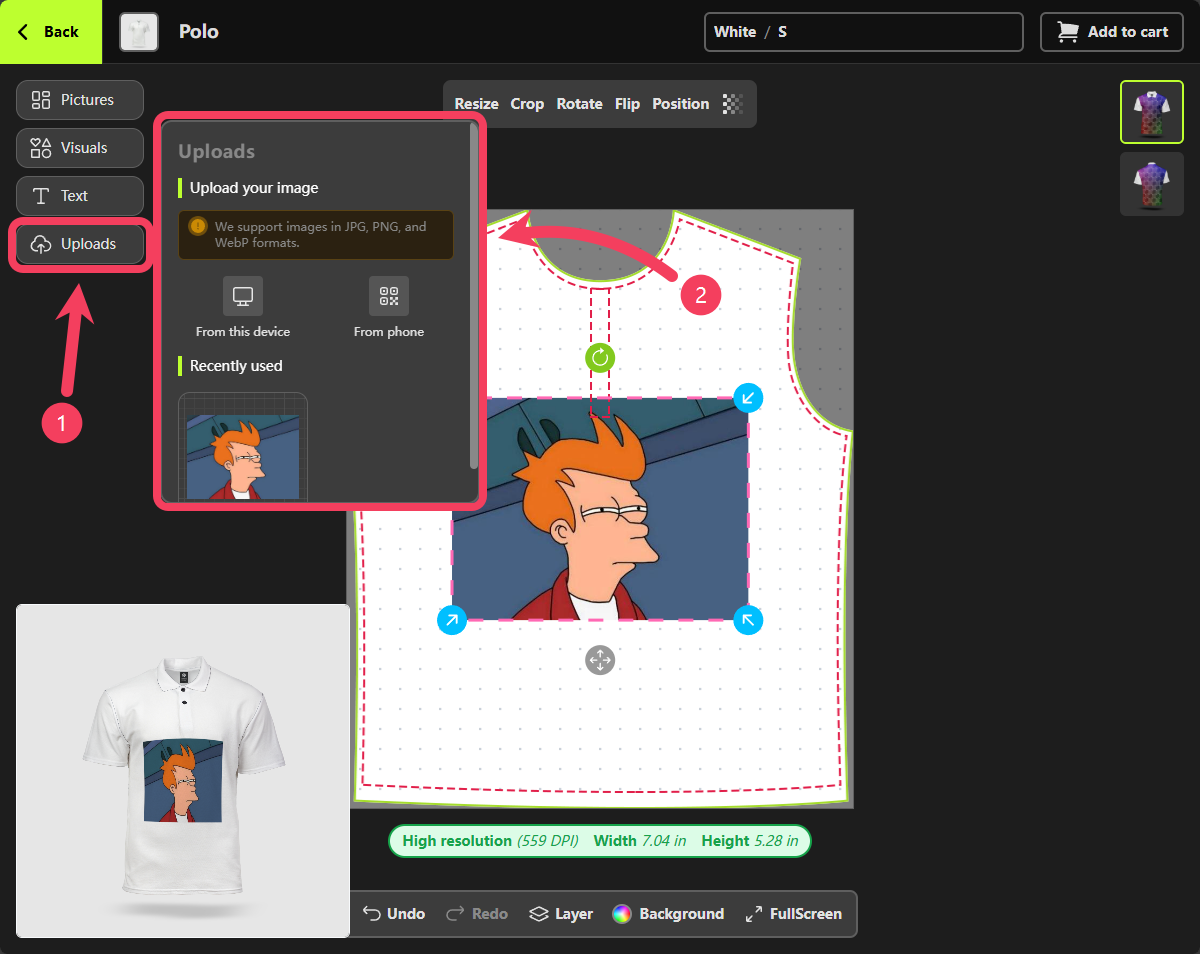
- Select Uploads as your method for adding design element.
- In the Uploads panel that appears to the right of the button, you can upload images by taking or selecting them from your current device. You can also upload images by scanning a QR code with your phone.
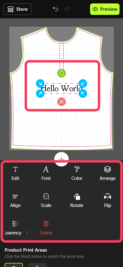
canvas. When you select a text design element on the canvas, a control bar for that text automatically appears above it. This control bar allows you to customize various properties of the text, such as color, font, and size.
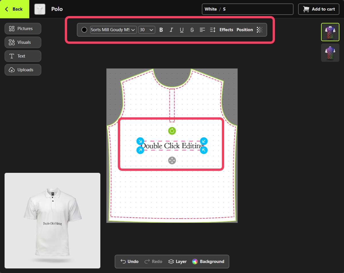
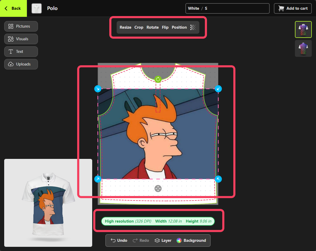
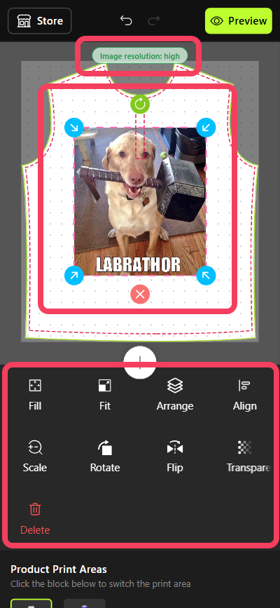
image design element on the canvas (excluding Visuals), a control bar automatically appears above it. This bar allows you to crop, flip, rotate, and perform other edits on the image.
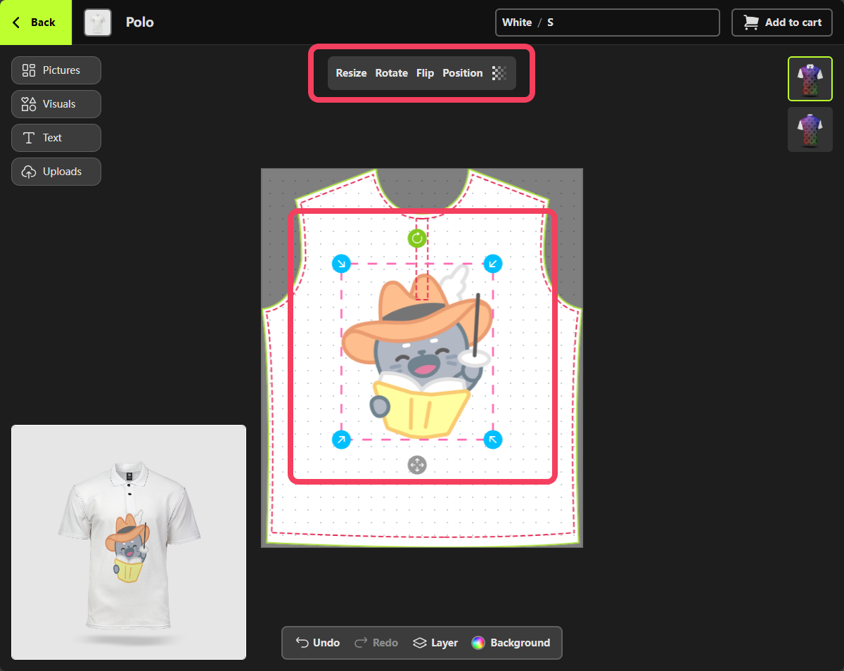
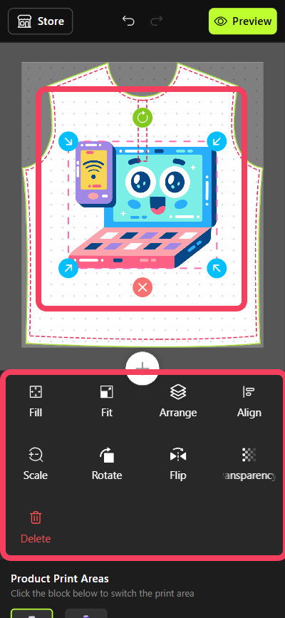
visual design element on the canvas, such as a sticker or emoji, a control bar automatically appears above it. This bar allows you to flip, rotate, and make other adjustments to the visual.
Visual design elements do not show print quality warnings like image elements might.
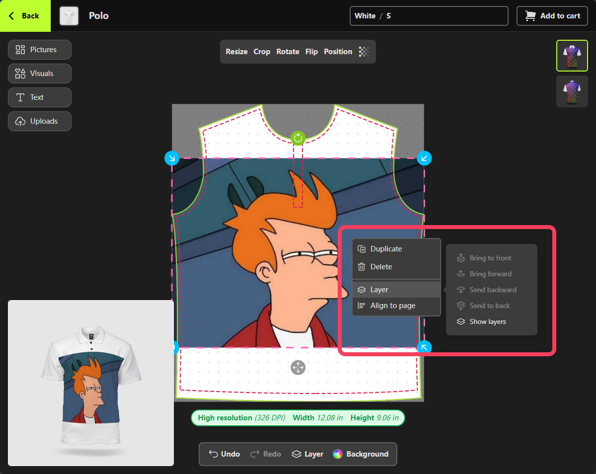
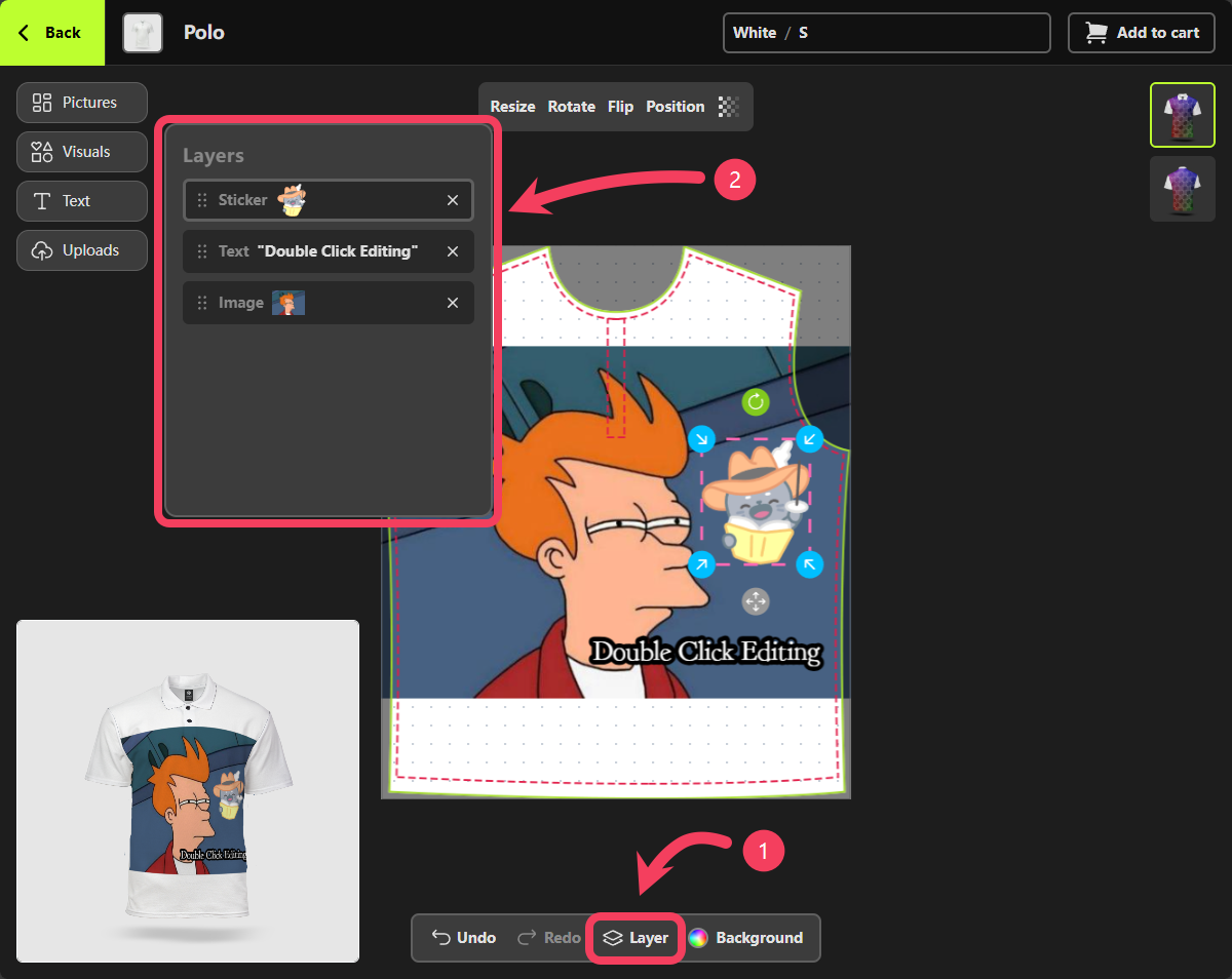
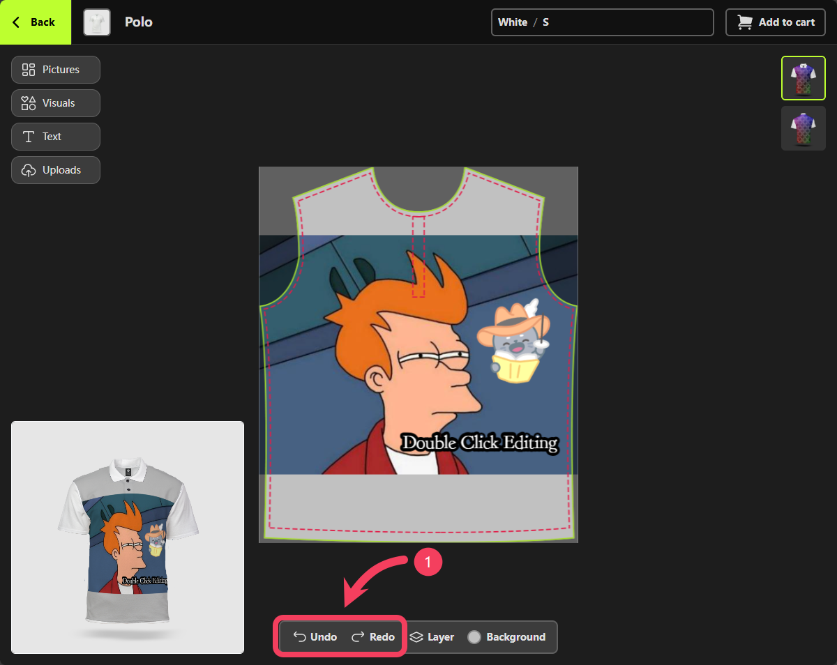
- Select Layer from the canvas control bar at the bottom of the Personalizer.
- In the Layer panel that appears, you can view, remove, and manually rearrange the order of the design elements by dragging them.
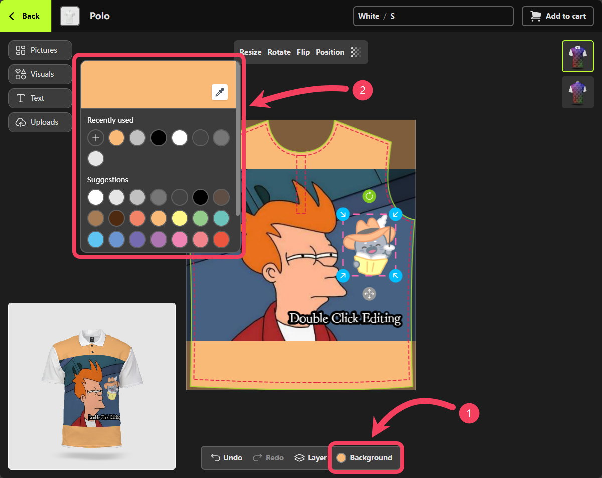
- Select Background from the canvas control bar at the bottom of the Personalizer.
- In the Background panel that appears, choose the color you want to apply.
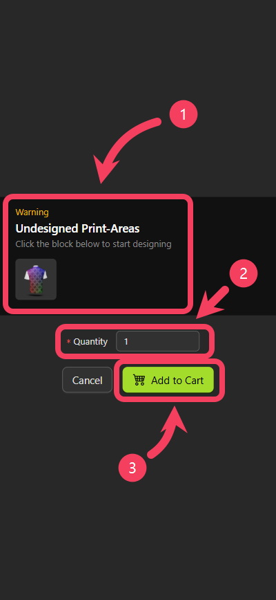
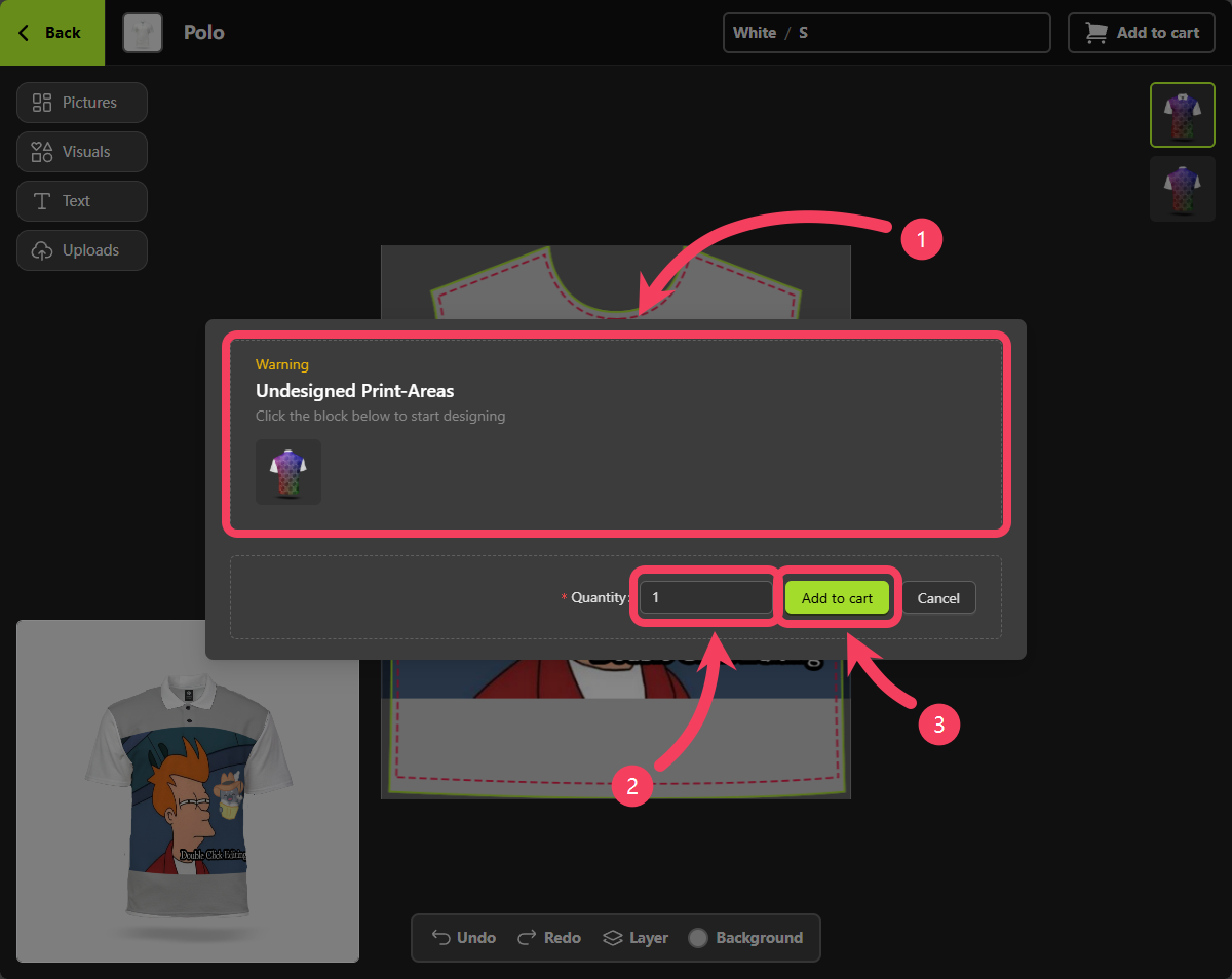
quantity of the customized product you wish to purchase.
Additionally, if there are any issues such as undesigned Print-Areas or images with poor print quality, the dialog box will alert you. It’s recommended that you make adjustments to your design based on these alerts to ensure better print results.
Use on Mobile Devices
Personalizer is available for use on both desktop and mobile devices.
When you access Personalizer on a mobile device, you’ll find a button in the center of the interface. Tap this button to add design elements to your canvas.
visual design elements to your canvas.
sticker that you like, then tap it to add it to your canvas.
sticker to your canvas, you’ll see it highlighted as the selected item.
Additionally, a control panel will appear at the bottom of the canvas, allowing you to perform various actions on the sticker.
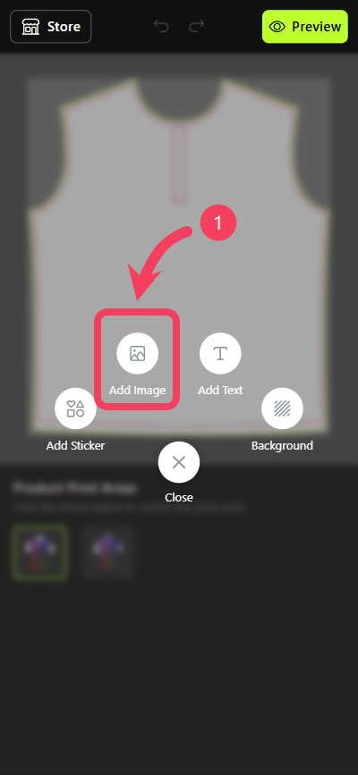
picture design elements to your canvas or upload your own image.
Pictures feature, please visit Picture Collections tutorial.
Tap Pictures in the interface.
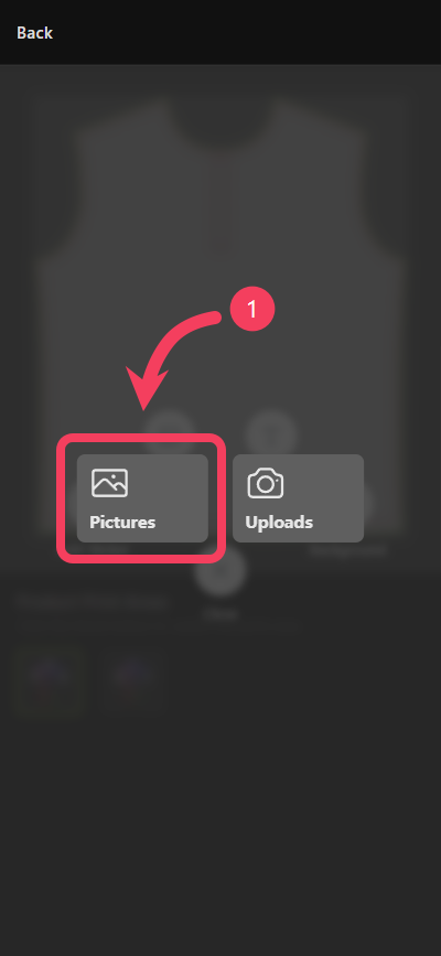
- Choose a
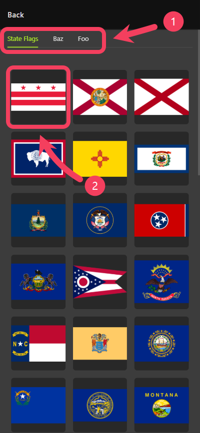
picture collectionthat you prefer. - Select a
pictureyou like, then tap it to add it to your canvas.
picture to your canvas, you’ll see it highlighted as the selected item.
Additionally, a control panel will appear at the bottom of the canvas, allowing you to perform various actions on the picture.
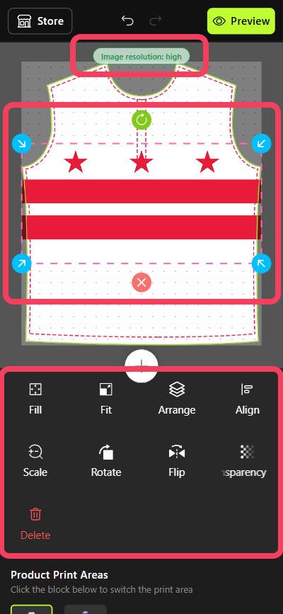
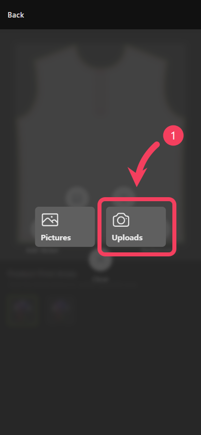
image to your canvas, you’ll see it highlighted as the selected item.
Additionally, a control panel will appear at the bottom of the canvas, allowing you to perform various actions on the image.
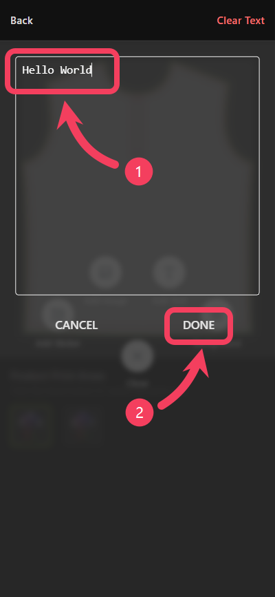
- Enter the
textyou want to display in the multiline text box. - Tap DONE to add the text to your canvas.
text to your canvas, you’ll see it highlighted as the selected item.
Additionally, a control panel will appear at the bottom of the canvas, allowing you to perform various actions on the text.
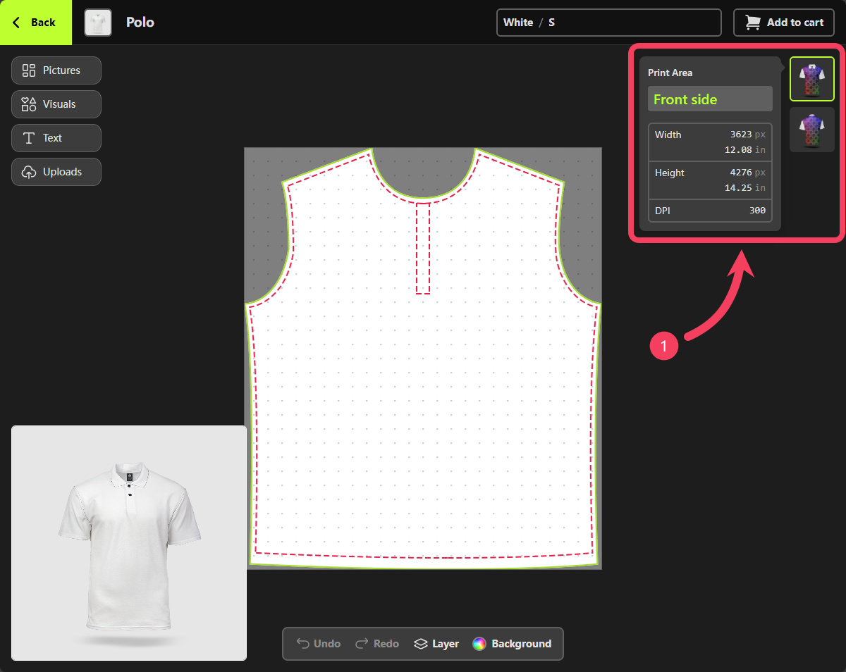
- After finishing the design for the current
Print-Area, you can switch to other Print-Area of the product to continue designing. - Once your design is complete, tap the Preview button located on the right side of the top bar in Personalizer to preview the final look of your design.
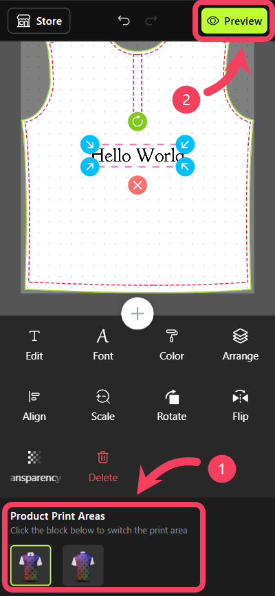
Preview interface, you can not only see your design but also view and switch between all available product options, such as color and size.
Once everything is confirmed and looks good, tap the Add to Cart button at the bottom of the Preview interface to proceed.
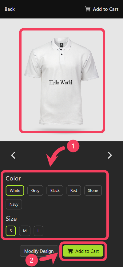
quantity of the customized product you wish to purchase.
Additionally, if there are any issues such as undesigned Print-Areas or images with poor print quality, the dialog box will alert you. It’s recommended that you make adjustments to your design based on these alerts to ensure better print results.